
Note: the below was originally written and published in January 2019. I edited the post for clarity and added a few notes on using the Tidyverse suite of packages to do summarize data in R, but you can still find the original here. Not an R user but need an efficient way to average plot data? Check out this post on doing the same thing in Excel.
In agronomy research, its very common to collect multiple plants from a single plot, take measurements on them, and average those measurements. The plot average is the value we run statistics on, whether that means building a regression or running an ANOVA.
I’ve recently seen a lot of students averaging measurements by hand or in Excel. This works, but it takes a long time and has lots of opportunities for human error. I know I promised you more posts about SAGA and writing, but watching this process is very painful so I’m channeling my energy into writing this blog post. Assuming I don’t get distracted by other exciting or frustration-inducing things again, I’ll get back on topic next post.
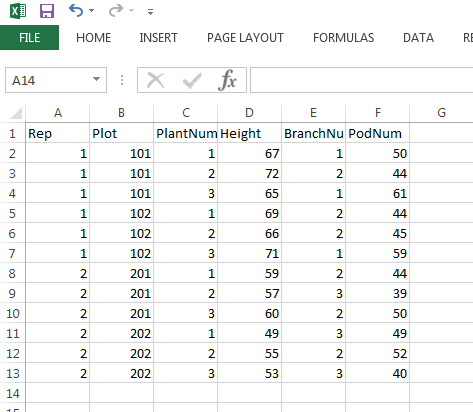
To get started, here is the short example spreadsheet I will be using today. I saved it as a CSV file, mostly out of habit but also because CSV files work well in SAGA, QGIS, and R. I also don’t have spaces or punctuation in my column/variable names, which helps prevent confusion later on.
I made an R project file for this example. This is not a necessary step, but if you’re not familiar with project files, you may want to learn more here.

I will attach my full script at the end, and include screenshots throughout. Let’s pretend I wanted to know the average height of my plants by rep. The first 10 lines are just getting the data from the CSV files and into R. The 11th line gives you the mean for each rep, and you can see that output in the console panel at the bottom. Learn more about the by function in the R Documentation here.
I use the by statement when I just need to get a quick look at my data. You can also make a bar chart of the means by a rep by saving the output of the by statement to a variable.
When I’m averaging data by plot, I usually use an aggregate statement. You can average multiple columns at once, save the result to a data frame, and then write that data frame. You can see this in line 15, where I use cbind to group all the variables I want to average and aggregate to say how to group the data. Line 18 is an example of how to write a CSV file in R.

Learn more about aggregate here, learn more about write.csv here, and a copy of the whole script is available here. These functions work for many applications beyond averaging plot data, and there are also many other ways to do precisely this thing. This is a brief example simply meant to introduce an efficient solution to a common problem. Please don’t keep averaging things by hand– there are a bunch of better ways.
New information as of June 2020: I still consider myself pretty new to the Tidyverse, but I find the suite of packages to be incredibly helpful and intuitive. I’ve started using dplyr to process more of my data recently and find it both easier to interpret and more robust against irregularities in my data and column headers. I’m not going to provide a whole script for this example, but if I were to average height, branch number, and pod number by plot in the data frame above and save it as a new data frame titled “meandata2” I would do it like this:
library(Tidyverse) #load the tidyverse suite of packages to have access to functions in dplyr
meandata2<- d %>% #name the new data frame, call the original data frame to summarize
     group_by(Plot) %>% #define the groups you want the data summarized by
     summarize(meanH = mean(Height), meanB = mean(BranchNum), meanP = mean(PodNum))
If you want to learn more about summarize and how you can use it with group_by, you can learn more on this dplyr help page. I have found that investing time in learning the Tidyverse has paid off, saving me both time and hassle, and I’m now almost exclusively using this method for summarizing my own data.
