Back in January I shared my favorite way to average plot data in R, but some of my lab mates don’t use R and are looking for an alternative. They keep averaging their plot data by highlighting 10 cells at a time and using the AVERAGE function, which is rather inefficient and introduces human error. Greg, just for you I am providing this improved Excel-based method. I learned pivot tables for you.
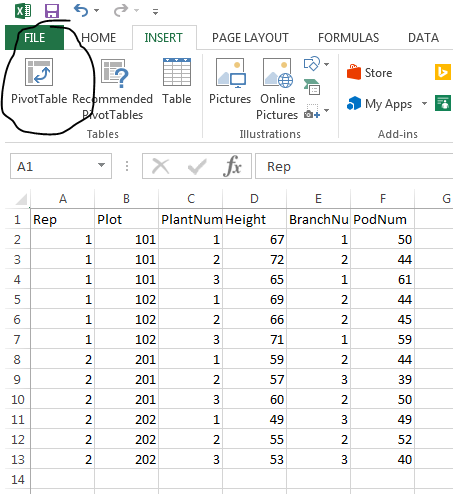
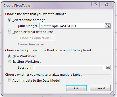
I saved the example spreadsheet from the R example as an Excel workbook. From there, I highlighted my data and went to “Insert” on the main menu. Then you click the “Pivot Table” button and the following pop up appears. If you’re content with the pivot table becoming a new sheet in your workbook, all you have to do is click OK. If you want it elsewhere, change the location options before selecting okay.
After that, you’ll be directed to the new worksheet with the pivot table menu.
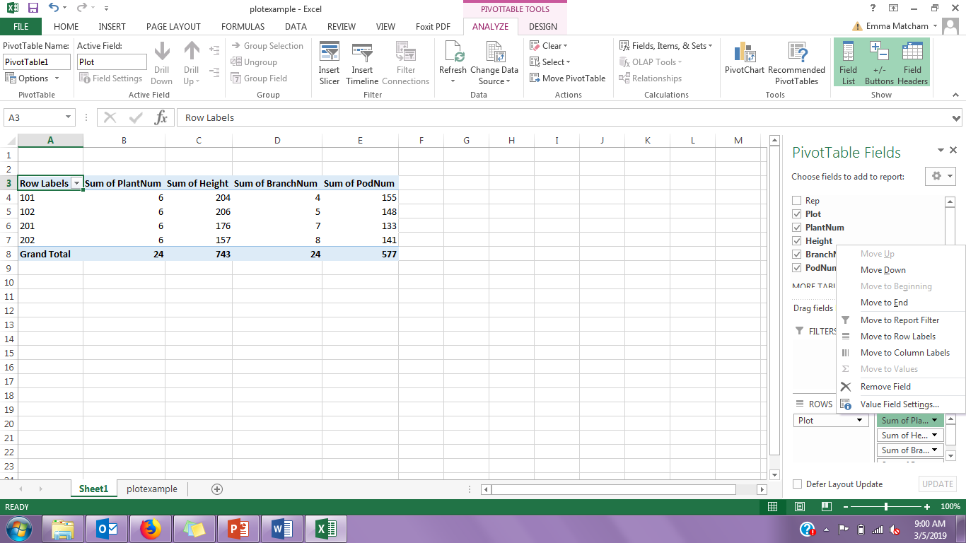
Click and drag the “Plot” label to the “Row” cell in the Pivot Table Fields menu. Then take the traits you want to average and drag them to the “values” cell in the menu. Click the down arrow next to the individual value and select the “Value Field Settings” option.

From there, select the “Average” option in the pop up menu and click OK. Do that for all the values you want averaged.
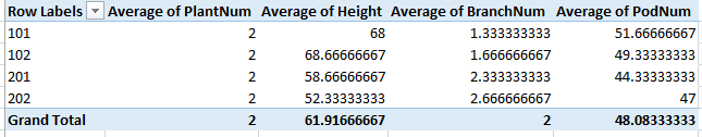
That’s it! You have a quick, accurate table of means by plot. In this 4-plot example it didn’t save a ton of time, but 4 plots is wildly unrealistic. Most of our trials have at least ten times that, and averaging 40 plots by hand is just not necessary. I’ve shared my code to do this in R, and now you have a quick guide for averaging using Pivot Tables (see the final table below). If you’re a SAS user and want to share your methods for that, email me or comment on this post and I’d love to have you guest-blog!