
Last week I posted some tips for reading violin plots, and this week I decided to play around with making some of my own! I use box plots pretty regularly, so I first tried remaking one of my own box plots as a violin plot instead. Today I’m only going to share information about making plots using the ggplot2 package in R, but Chartio and Tableau also have some user-friendly violin plot options.
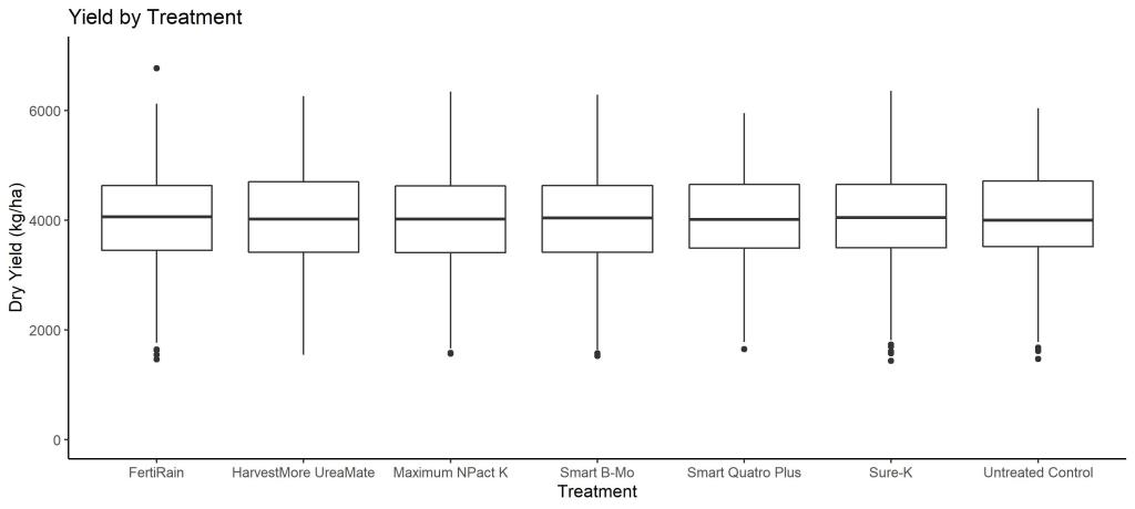
This data was collected at 46 different sites, and each site had a different average yield. When we summarize the data using box plots by treatment, the boxes are very tall and have long whiskers (the lines coming off each box). Tall boxes with long whiskers indicate that the data has a large range. Also, the boxes also look very similar to each other, which indicates that there aren’t many differences in yield between treatments.
I made the boxplot using ggplot2, an R package in the Tidyverse. If you aren’t familiar with it, ggplot2 is a package that contains the function ggplot, and ggplot can make basically any graph you may ever want. Here are the 3 lines of code I used to make my box plot. “yieldbox” is the name of the plot/object I created, ggplot is the function, and my data frame is “dY”. My grouping variable is “trt,” the variable I am summarizing is “yield_kg_ha,” and both “trt” and “yield_kg_ha” are variables in “dY.” The first line of code is what is actually required to make the box plot, and the next two lines are aesthetics and labels. There are other, better, starting guides to ggplot out there on the internet, but for today this should be enough to orient you to what I’m doing.
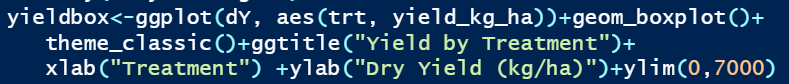
After doing precisely no research about whether ggplot can make a violin plot, I decided to change the “geom_boxplot()” to “geom_violin()” just to see what happens. To my genuine surprise, I ended up with a simple violin plot of my data.
This tells me a little bit more information about how the distribution of yield differs between the treatments. For example, the Smart Quatro Plus violin has a shorter tail on the upper end of the yield distribution. I know this data set pretty well, and I know that the Smart Quatro Plus treatment was not applied at the second highest yielding site in our study. It’s cool that we can pick up differences that the box plots obscured, but what if I also want to know the mean?
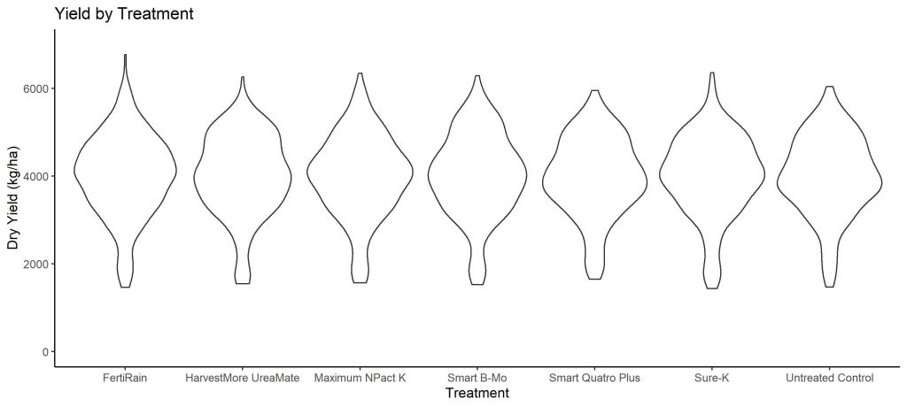
Since I know you can layer different plots on the same axes in ggplot, I decided to just see what would happen if I kept both “geom_violin” and “geom_boxplot()” in that first line, which resulted in this.

Violin plot with the box plot on top.
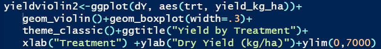
So, this does have all the information I need in it, but the boxes look a little silly and block some of the violin. I changed the width of the box plot by using “geom_box(width=.3)” and made another version.
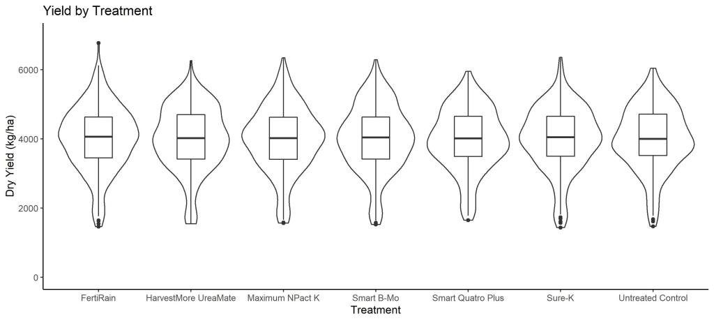
I’m overall happy with this final plot– you can see the code I used to the left. I love that ggplot works the same way for lots of different types of graphs and that my experience making box plots was so transferable to making violin plots.
I have since done a little more reading on violin plots and came across a very detailed tutorial from Statistical tools for high-throughput data analysis (available here), and I highly recommend checking it out– they go over great details on different data summary options you could use inside of the violin plot instead of the box plot, and they cover horizontal violin plots, grouping options, and colors.
I hope this overview helps you get started with violin plots in ggplot2, or at least helps you see some comparisons between box plots and violin plots. I certainly had fun playing around with them!
