
I have been seeing more violin plots recently and wanted to share some tips for reading all the information violin plots can show. At first glance they can be confusing and hard to read, but really, all the parts of a violin plot are probably something you’ve seen in another graph type before.
First, what does a violin plot look like? Here are two examples in papers I’ve seen recently.

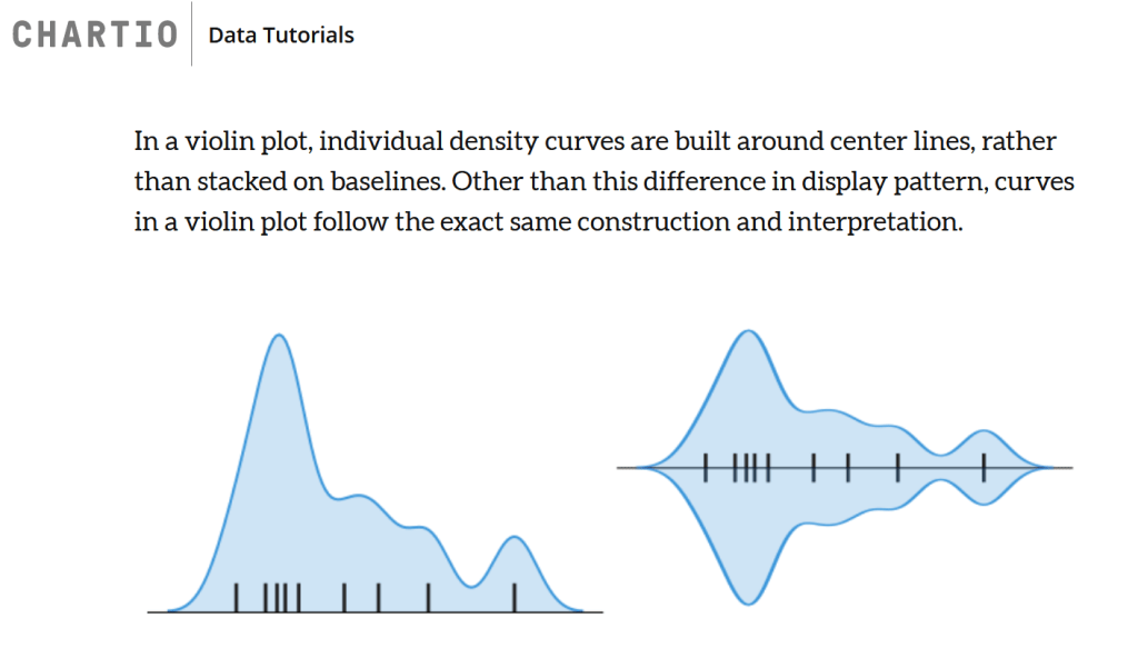
The violin plots from Kuyah et al. are horizontal, showing the lowest values within each “violin” on the left and the highest on the right. You’ll notice that their violins are basically just line drawings or outlines without anything in the middle, and all the violins are symmetrical about their center horizontal axis. These violin outlines can be read like a kernel density plot, which you can read kinda like a histogram.

Conderelli et al. presented vertical violins that are filled in (not just outlines like Kuyah et al. used) with some additional rectangles and lines in the middle. To be clear, the smooth violin shape is the actual core of their violin plot, and the additional information is essentially a box plot superimposed over the violins. This allows a violin plot to show the detailed data distribution you get in a kernel density plot, plus the median and interquartile range information you see in a box plot.
In this type of plot the bounds of the IQR are shown by the edges of the large white box, and the median is shown with the horizontal line within the box. Lines extending from the box show the full range of data, and sometimes dots outside of the ends of the lines show observations that are considered outliers. Other violin plots I’ve seen forgo the full boxplot instead have a dot for the median on the center axis of the violin plus a square for the mean.
In short, violin plots are used to show the distribution of data and can provide more information than a standard box plot. If you’re looking for a more detailed explanation of how different data distributions would appear in a violin plot, I highly recommend this post from Eryk Lewison at Medium– the GIF at the end is a great visualization of what data a violin plot can show that a box plot might hide.
I’m starting to play around with making violin plots of some of my own data and look forward to sharing some methods and tips later in the week!
