
Last month I posted about how to read box plots, and today I’m sharing how you can make your own. I picked two online tools that don’t require you to calculate the mean and quartiles yourself and shared a quick couple lines of code for the R users out there.
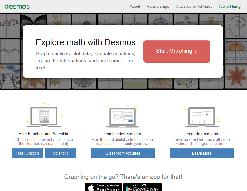
Let’s start with Desmos! Desmos is essentially an online, point-and-click graphing calculator. The tool I use most is the quadratic graphing feature where you can input the coefficients for multiple functions at once and graph them together, but you should definitely check out their demos and other tools.

The box plot tool is very straightforward– input your data on the left hand side and your plot will be generated on the axis. You can zoom in and out, making this a great tool for data sets of all sizes. My favorite part about the Desmos tool is the “Random stuff about your data” drop down– this shows you things like length, quartiles, and more!
The plots from Desmos have clean lines and are very easy to read. That, in combination with the random stuff tab, makes Desmos my favorite tool for exploring my own data during analysis. But, they don’t have good axis label options, so I don’t use Desmos for graphs I plan on sharing.

MetaChart is a much better tool if you need to label axes, play with colors, or do other formatting. It works very similarly, but you have the option to read in a CSV file instead of type your data entries (see left). Just add your data and follow the menu prompts for labels and display.
If you’re already comfortable with a software like R or SAS, use these to make gorgeous box plots! Want to make your box plots in SAS? I thought this guide from Tutorials Point was well written and easy to follow, despite my lack of SAS confidence.
R has a single function that gives a simple box plot. If I want box plots of yield (a numerical vector) by treatment (a category) and my data is in dataframe d, just use “boxplot(yield~treatment, data=d)”. Want to get fancier? The R Graph Gallery has amazing examples and tutorials available here (see some of there examples below).
I hope these four tools help with your data visualization needs, and remember to check out my previous post on reading box plots if you need an interpretation refresher!

