
Box and whisker plots are one of my favorite ways to visualize data, but they can be challenging to read if you haven’t seen them before. Today I’m going to show a couple examples, and in the future I’ll show you how to make your own!
Firstly, box and whisker plots are also called boxplots. They can be oriented horizontally or vertically, and you’ll see examples of both throughout this post.
To orient you with the parts of a boxplot, here is a great graphic from Towards Data Science. I like this figure because it’s clearly labeled, and its values are based on the standard normal distribution (centered on 0, standard deviation of 1).

When I read boxplot, I move from the center out. The center line is the median, or middle value. Half of the data is below this value, and half of the data is above this value. The left side of the box (or bottom of the box if the plot is vertical) is the first quartile. One quarter of the data falls below this value. The opposite side is the third quartile. Half of the data in the plot falls within the box, and the size of the box is the interquartile range.
Moving away from the box, the lines (or whiskers) show the minimum and maximum non-outlier values. What’s an outlier? A low outlier is defined as anything smaller than the first quartile minus 1.5 times the interquartile range. A high outlier is defined as anything bigger than the third quartile plus 1.5 times the interquartile range. These outlier values are shown as dots or asterisks. Not all data sets have outliers, so don’t be surprised if you don’t see them.
This is an example of yield data from an extension article titled Sifting and Winnowing by Spyros Mourtzinis, Shawn Conley, and many others. These boxplots have something else inside the box– a dotted line for the mean!

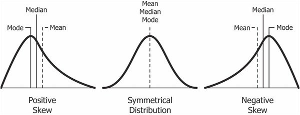
These boxplots have something else inside the box– a dotted line for the mean! Seeing whether the mean is above or below the median helps us understand if the data is skewed or not. Most of the distributions are not particularly skweed, but 4R and 9I are a little bit negative skewed, and 1R is a liftle positive skewed. If you want to learn more about skew, check out this image from Code Burst.
What else can we learn about the yield from these box plots? The varying box sizes tells us the spread of the data is different for each TED. TED 3R had the lowest yield overall, and 9I had the highest yields.
One thing boxplots can’t do on their own is show statistical significance– they only summarize data distributions. But, in the case of 3R and 9I, the yields are definitely statistically different since the range of the data does not overlap at all. If the whiskers overlap but the boxes don’t, like 7R and 9I, the means are probability statistically different too. But, be careful assuming something is statistically significant from a boxplot alone, since a boxplot won’t necessarily show you sample size and doesn’t incorporate values from a t-distribution in its calculation. If you wanted to show statistical significance on a boxplot, usually you draw brackets between two boxes and have the p-values written on the brackets.
Feel free to comment with more boxplot questions, and keep your eyes open for future posts about creating your own boxplots!
