
Those of you complaining about the weather may feel validated by this headline from CNN (article here). For the over 1 in 10 Americans work in agriculture and related industries (source), this has real consequences. The increased rain this spring delayed planting, and in some places planting was prevented altogether. The Washington Post has some really stunning satellite photos that show the difference in greenness across the north-central US between 2018 and 2019 (available here— much better on desktop than mobile).
Beyond the fact that it references my MS advisor, this article also has a nice graphic of relative crop health compared to normal. I’m going to ignore the fact that it doesn’t specify the years used in the multiyear mean, and the fact that the chlorophyll content methods are vague and buried in the bottom of the article. It’s a nice neat graphic in a non-academic article that reminded me that not all states suffer under higher-than-average rainfall.
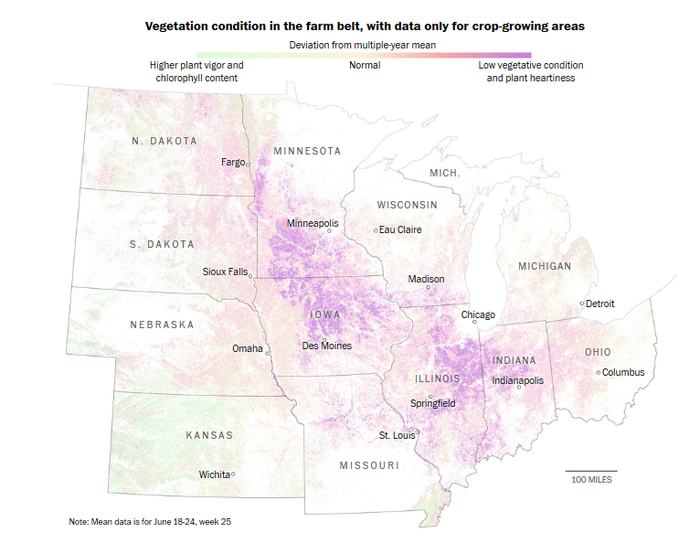
The Dakotas, western Nebraska, and much of Kansas rely on irrigation to grow crops. In a particularly wet year, they can see improved crop health. If this trend continues throughout summer 2019, they may see higher yields than usual. Will that make up for the rest of the US? No. Is my home state of Ohio still hurting? Certainly. But, in the age of climate change and general uncertainty, I personally needed the reminder that not everything is terrible (and maybe you did too).
While I disregarded the poor methods description accompanying this image, I am going to harp on its color choice. The darkest color green and the darkest color purple have different intensities, visually weighting the poor health area. This helps make the article’s point, but is misleading. The yellow-pink “normal” color is also really hard to see and difficult to distinguish from the slightly-better, slightly-worse, and no-data areas. There are tons of diverging color gradients available that would do a better job– my personal favorite is the blue-white-red scheme. I included an example of that color scheme from NOAA below because it’s a graphic you may be familiar with, and it is a clear example of diverging color gradient. Also, this map’s content seemed relevant to this blog post. Don’t like the blue-white-red? ColorBrewer has great options!

For those of you who work in agriculture, I’m sorry for being just another person talking about #NoPlant19. For everyone else, I hope this provides some prospective to go along with your disappointing weather forecast. Thanks for reading!
