
There are a lot of good ways to compile different images into a single figure. For me, the print composer in QGIS works to get my map, scales, and legends into a single TIFF to embed in a word document or send as an attachment 90 percent of the time. The other 10 percent of the time, I have to get a little creative. Sometimes I use Draw.io or Inkscape, but if I’m feeling really lazy and the figure is simple I just use PowerPoint…
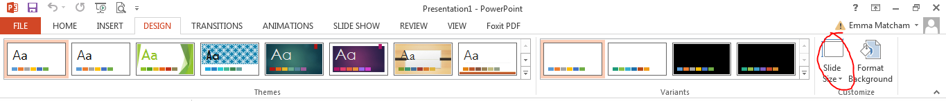
To make a figure in PowerPoint, start by changing your slide size to be the size you want your final figure. Go to the “Design” tab on the main menu and then go over to the “Slide Size” tab. From there you can input a custom slide size.
If you, like many Spatially Challenged readers, plan on submitting to a Tri-Societies publication such as Agronomy Journal, an approximately 17.8 cm wide image will be a full page width. A single column image is just 8.5 cm to account for the margin between columns.
Once your slide size is set, just use the “Insert” menu to gather and place your images from other files or add shapes and text as needed. If it’s a multi-panel figure, PowerPoint makes it really easy to label the different parts with letters or even divide your panels with frames.
After you make your image, you can use the “Save As” feature to change the file format. If you’re exporting as a PDF, the default settings will probably be pretty good resolution. I needed to get TIFF files this week, and the default settings were noticeably blurry. I used step-by-step directions from Slide Cow (available in a video here)– the directions were to follow and the final image looked fantastic!
