
Columbus is the 14th largest city in the US, and by far the most populous place I’ve ever lived (source). It’s the 2nd largest in the Midwest, just after Chicago. But at roughly 879,000 residents, Columbus is truly tiny compared to many global cities.
I know it’s a fairly small city, but I can’t really fathom just how much bigger global metropolitan areas are. That’s why I’m so enamored with this interactive map from The Pudding. 
When you click the “View Population” button, it loads an interactive map with a guided tour in the lower left-hand corner. 
You can go through the guided tour and click and drag your way around the map– just give it some time to load all the population bars. The “Compare to 1990” button splits your screen, showing you the same map extent at two different times. They also have a 1975 option within the comparison screen. 
The “Change” button shows the population growth rate, where positive growth is red and negative growth is green. This might be the feature I like the least, simply because the colors aren’t very friendly to colorblind users. The areas with some population growth, even if it’s small, tend to blend into the background. Still, it’s a great way to visualize something that’s a little hard to imagine. 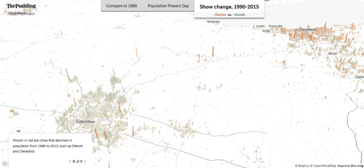
We’re finishing up fall semester and getting into the holiday season, so I hope you don’t mind a few lighter posts this month. I’ve really enjoyed this map– send me your favorites too!
