
Note: the below was originally written and published in November 2018. I edited the post for clarity and added a few notes on accessing some learning resources in R Studio itself, but you can still find the original here.
This month I’m making lots of graphs in R and wanted to share some of the resources I use to both inspire the types of graphs I use and then actually make them.
R is an incredibly powerful, free statistics software. It can be used to process large data sets, run all sorts of statistics, make beautiful graphics, and even map data. This post is meant for current R users of all skill levels, but if you haven’t used the software before this won’t give you the skills you need to get started. I’ll leave that for another time.
I make my graphics in R or Matlab. Lately I’ve been using R more, simply because I haven’t updated my Matlab license… have I mentioned I love free software? For a quick graph to get a handle on the distribution of my data, I’ll use the base R graphing features. But, if I’m going to share the graph with anyone else I prefer to use ggplot2.
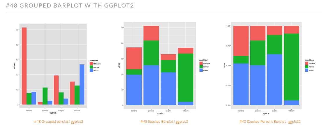
ggplot2 is a package meant for making beautiful graphics. The learning curve is a little steep, but once you learn how to make simple charts it’s easy to expand into complex, detailed ones. Check out the R Graph Gallery to help get started– it has a lot of great ggplot content (and some truly inspiring data visualization examples). Below is a simple comparison of three different types of bar graphs from the R Graph Gallery. I used some of their accompanying example code to make some multiseries bar graphs for my thesis.
This is a ggplot2-cheatsheet I downloaded from the RStudio help site a year or two ago. The first panel goes through the basic steps of building a plot in ggplot2, and the rest of the first page goes through how to graph different types of continuous and discrete data. Even if you aren’t an R user, I think the breakdown of graph types by data types is worth reading. There are some graphs I had never even heard of but now find really helpful.
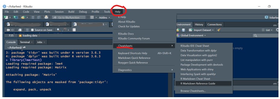
You can also access R cheatsheets on ggplot2 and other topics in RStudio directly by going to the Help menu and scrolling down to the “cheatsheets” tab (see screenshot below). I really like the dplyr cheatsheet, too.
One thing that I found challenging about ggplot is that it doesn’t integrate will with the usual function for tiling multiple graphs, par(). Fortunately, someone else has already solved this problem using a really excellent function called mutliplot. Just copy multiplot into a script, run it, and you’ll see the function pop up in your workspace. Then call the function the way you would any other. I appreciate simple, well-made solutions to R problems. If you ever run into a situation where you know which function to use, but can’t recall the correct syntax to use the function, you can type ? and then the name of the function in console of RStudio to open up help text specific to that function.
Today’s take home messages: (1) ggplot2 is the way to go for graphics (2) ggplot2 is a little intimidating, but there’s lots of support from R Graphic Gallery and the RStudio cheatsheets (3) I really love well visualized data! Happy graphing!
