
I’ve used the Global Yield Gap Atlas for a few projects over the last couple years, and it’s a great resource. GYGA measures the yield gap (difference between potential yield and achieved yield) of many crops grown in many environments, and provides downloadable data for other researchers.
One tool I use from GYGA is their raster layer of Technology Extrapolation Domains. You can learn more about TEDs here, but in short, they are one way to define an environment where soils climate are uniform within a given TED. Grouping fields based on TED is helpful for my research because a given practice (tillage, row spacing, rotation, etc.) is likely to have the same impact on yield within a TED. By contrast, in different environments a practice can have wildly different effects. In much of Michigan, narrower rows have lower soybean yield due to increased white mold pressure. In much of Ohio, narrower rows have higher soybean yield due to faster canopy closure. If I’m doing a row spacing study, I should not default to combining data from Michigan and Ohio and should instead use a tool like TEDs to determine which areas are likely to be similar or different.
The TED framework differs from other grouping techniques like cluster analyses because the boundaries of each TED stay the same year-to-year. Knowing which fields are likely to have a similar management by environment interaction is helpful for me when I’m planning where to put certain trials.
I’m highlighting GYGA today because they just released a new map viewer tool. On the main GYGA homepage, navigate to the atlas by clicking the “Go to the Atlas” button on the right (or just go here)

From the atlas, there are lots of options for visualizing the yield, yield gap, and more for many crops around the world. This is just one map I was interested in today– the yield gap for rainfed (non-irrgated) corn. The scale goes from green to red, and green countries have smaller yield gaps. Red countries are places where management practices could likely shrink the yield gap and allow farmers to grow more grain.
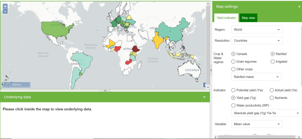
I love that you can click a country to see the data used to generate the map, and I really appreciate the the yield data and technology extrapolation domain boundaries are available for free from the GYGA website. If you have any need for grouping locations based on environment, it’s worth checking out TEDs, and I highly recommend you play around with the new atlas map viewer tools too!
