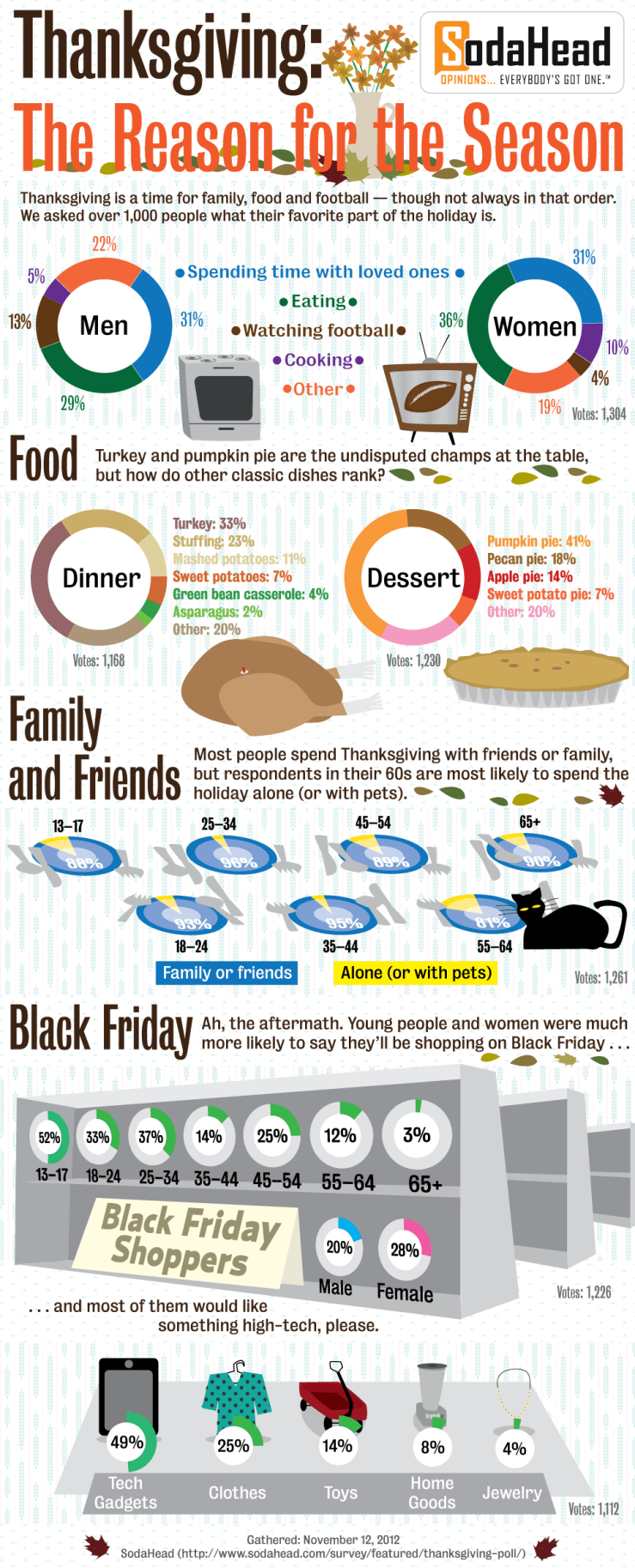
But wait– there’s more! Earlier in the week I shared Esri’s awesome interactive Thanksgiving map and a cool pie chart, but I also wanted to highlight this well-made graphic from Visually. The donut charts are really easy to read, especially with their vibrant-but-not-distracting color scheme. They included the data source and respondent number in unobtrusive but clear ways. I also like how they use the section title/caption to break up the large image into different graphs. Enjoy, and happy Thanksgiving!