
We’re getting into the holiday (finals…) season, so I’m a little short on time for detailed how-to posts right now. Instead, I’ll share some quick posts about well made Thanksgiving related maps and graphs!
Last year Esri created an interactive map Where does your Thanksgiving dinner come from? that combines some of my favorite things– maps, food, and food production! I was surprised how dispersed the production of turkeys was throughout the US (left). I knew Wisconsin had lots of cranberry production, but I was surprised by the hot spot over New Jersey (right).


And because maps aren’t the only awesome holiday graphics, enjoy this pie themed map from the Huffington Post! I like how they changed the lattice direction on the blueberry pie compared to the cherry– it makes it much easier to read than if they lined up. 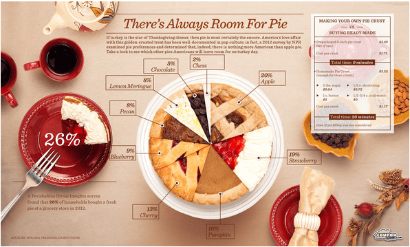
Definitely check out the Esri link to play with the interactive map, and enjoy I hope you have an excellent holiday!
