
This week I learned about a great tool from the US EPA called EJSCREEN, which allows users to visualize and download data related to environmental justice. The US has a long history of environmental racism, including building highways through predominantly black neighborhoods and using former factory sites for low-income housing. Pollution and increased noise exposure in these locations are linked to poor health outcomes and lower quality of life for Black and brown families in the United States. Providing access to environmental justice related data can help communities identify problems related to health risks and plan for a more equitable future, and I’m excited the EPA has made this information more easily available.

EJSCREEN makes it easier for folks to visualize the concentration of pollutants in their cities, and allows you to download environmental and demographic data for research and teaching purposes. A few features I’d like to highlight include the “Select Location” tool on the top menu. In the screenshot below, I used this tool to select a portion of eastern Indianapolis– a place weirdly dear to my Midwestern heart.
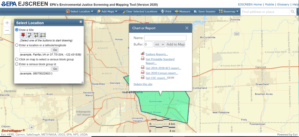

Clicking the “Explore Reports” option on the Chart or Report pop up panel allows you to explore data summarized to the scale of your location of interest. Navigating between Environmental Indicators, Demographic Indicators, and EJ Indexes gives you an efficient way to understand how this region compares to other locations in the US or State. You can also export this information as a data table.
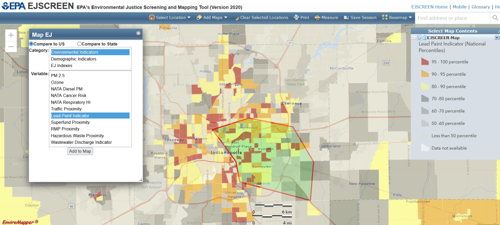
Other useful features include integrated mapping. Click on “Add Maps” and “EJSCREEN Maps” to open the Map EJ pop up. Below is an example of the map of lead paint risk Indianapolis. Note that defining a location of interest before mapping is not necessary, but if you have a location defined its outline will be displayed on the map.
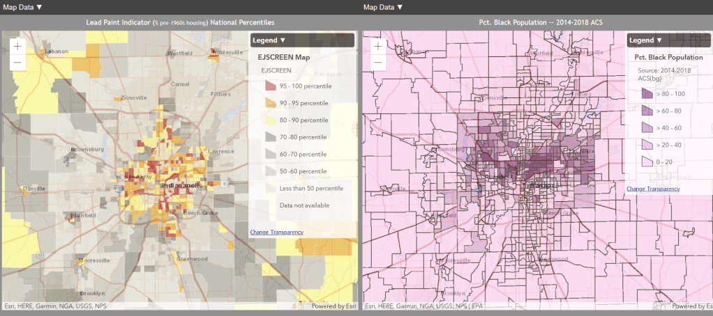
The side-by-side map feature (located in the “Add Maps” section of the menu) is very easy to use, and allows users to view different data from the same geographic location in a two-panel map. The data on each side can be changed using drop down menus– I personally think this would be a fun tool to use for in-class activities.
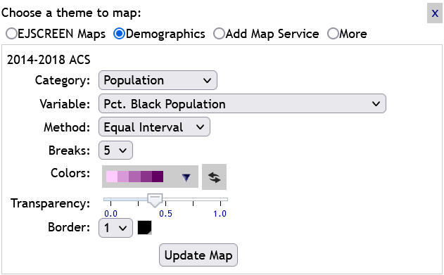
I was impressed by the number of options for displaying data, including equal interval, natural breaks, and quantiles– they both improve the data visualization, and allow a gentle introduction to spatial data visualization for students that might be interested in learning more about GIS in the future.
The mix of data types and effective user interface make EJSCREEN a great tool for a variety of teaching and research interests, and I’m excited to explore it more!
