
Have you ever wanted an infographic about making infographics? I found this one when looking for a succinct summary of some cool new visualization types like bubble charts and word clouds and thought it was worth sharing.

The above infographic focuses on the goals of your graphic. Do you want to compare a few categories? State one important fact? This type of thinking is really useful for me when I’m writing and already know what I want a graphic to say.
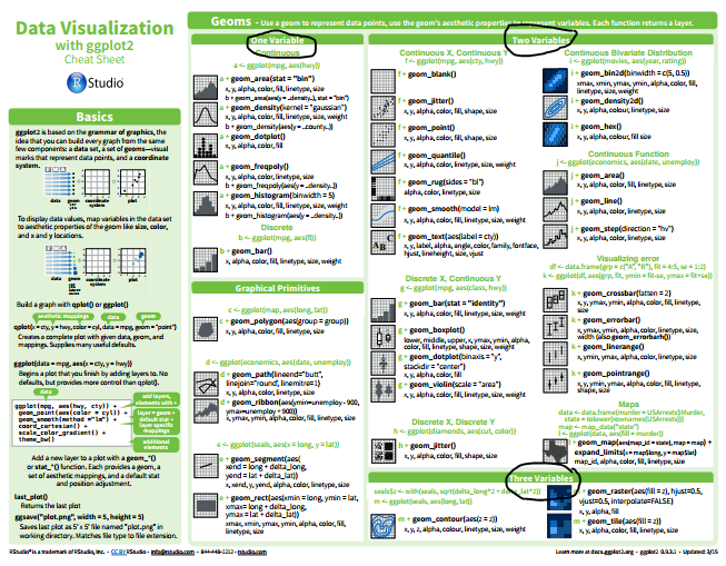
Sometimes instead of knowing what I want the main idea of a chart to be, I know what type of data I have. In those cases, I think about the data type (continuous, categorical, temporal, spatial, etc.) and choose a chart type from there. There’s a good tool for this on the ggplot cheat sheet (see my blog post about it here). It sorts the chart types by number of variables and then further organizes by types of variables (see below– variable numbers are circled in black).
Looking for a tool that has both data types and chart goals combined? I like the infographic below from Infogram. The text is a little small, but it has lots of good suggestions.

These three charts have been really helpful in organizing my thoughts when I go to make figures and graphs, and I hope you find them useful too!
