When I’m not maintaining my own blog, I like to read other people’s blogs. Today I’m sharing one of my favorites, Better Figures. The lead author, Doug McNeall, is a climate scientist in the UK. He uses his platform to give constructive feedback on graphics used in climate science. This blog isn’t updated super frequently, but all the posts I’ve read have been impressively detailed. I especially love that many posts are collaborations between multiple authors, highlighting different perspectives.
A favorite post of mine is “New adventures in global temperatures,” where McNeall interviews another scientist (Neil Kaye) about a cool new bubble chart to show global temperature. It was interesting to see all the thought that went into a single, high-quality figure.
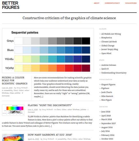
With that, I’m just going to include a screenshot of the Better Figures home page to entice you to go read it. Enjoy!